Learn about our complete brand typography system, starting with our custom fonts, variable styles, do's and dont's, and guidance on how to make an impact with type when using our brand.
resources
Download Fonts
Access our approved typefaces for all brand and communication use. Installing these fonts ensures consistent typographic styling across every platform and touchpoint.
Explore our typography principles, including hierarchy, spacing, and tone of voice alignment. Learn how to combine type, weight, and scale to create impact while staying true to our brand personality.
Inter is our primary typeface. It's a modern, highly legible sans-serif designed for a wide range of applications from digital interfaces to print layouts. With multiple weights and variable support.
Primary Typeface
Inter is a workhorse of a typeface carefully crafted & designed for a wide range of applications.
Core Palette
Weights & Specimen
The Inter family includes multiple weights, but our core usage relies on Regular and Semibold. Regular is ideal for paragraphs, captions, and long-form reading. Semibold provides contrast for headlines, navigation, and key highlights.
Á Ä Â À Ã Å Ā Æ Ć Č Ç Ð Ď É Ê Ë È Ė Ę Ğ Ģ Ī Í Î Ï İ Ĵ Ķ Ĺ Ľ Ł Ñ Ń Ņ
Ó Ô Ö Ò Õ Ø Ō Œ Þ Ř Ŕ Ś Ş Ŧ Ť Ţ Ú Û Ü Ù Ū Ų Ù Ŷ Ÿ Ž Ź
á ä â à ã å ā æ ć č ç ð đ ď é ê ë è ė ę ğ ģ ī í î ï ĩ ĵ ķ ĺ ļ ľ ń ň ñ
ó ô ö ò õ ø œ þ ř ŗ ś ş ß ŧ ŧ ť ť ú û ü ù ū ų ÿ ý ž ź
Typography defines how we organize and emphasize information. A clear hierarchy helps readers navigate content easily, ensuring each element from headline to captions works together. with balance and intent.
Subtitle
Use Inter Semibold to introduce supporting content.
We create tools that help teams work smarter, move faster, and stay consistent across every brand touchpoint.
Body Copy
Use Inter Regular for longer text.
Design is about more than aesthetics, it is about communication, clarity, and purpose. Every element, from color to type, contributes to how people experience a brand. By combining thoughtful design systems with flexible tools, we enable teams to express creativity without losing coherence.
typography
Core Palette
Incorrect Usage
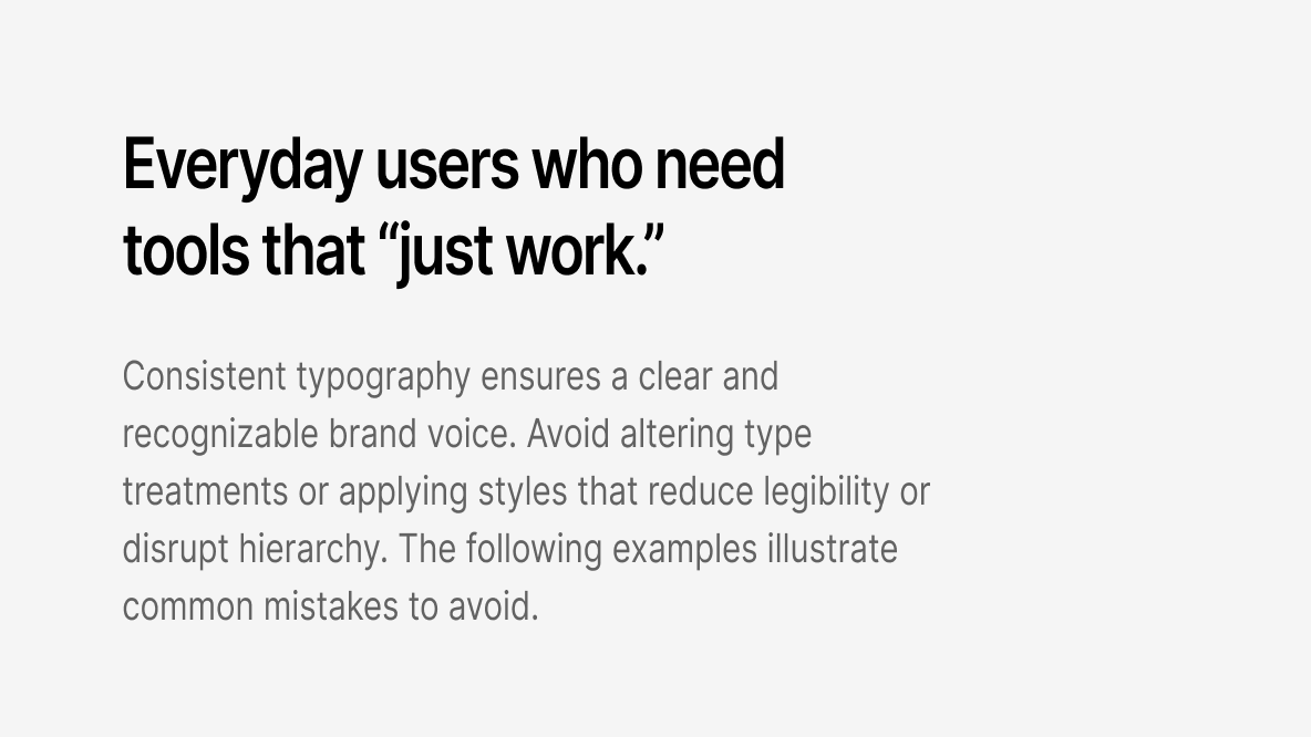
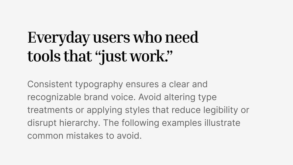
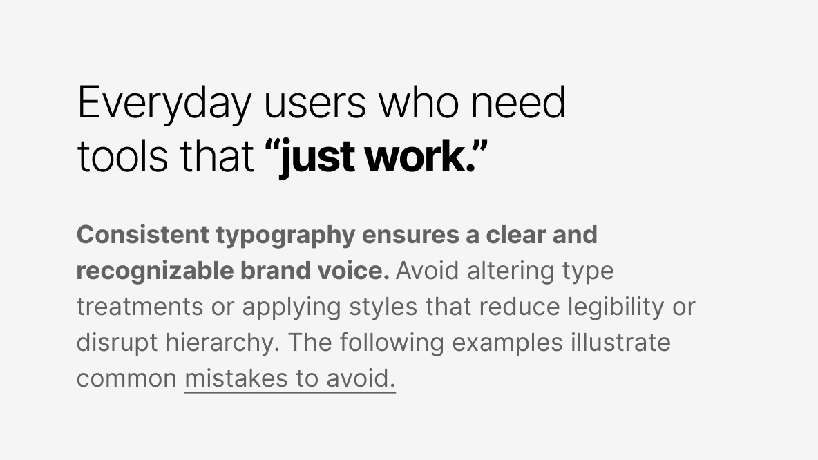
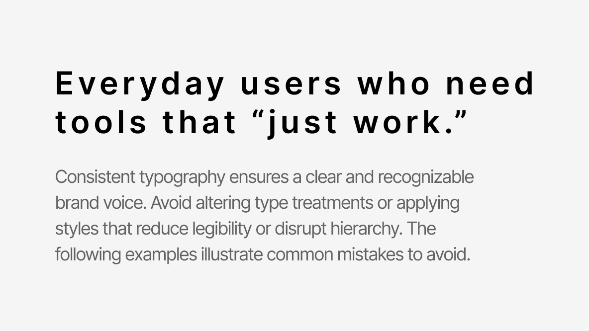
Consistent typography ensures a clear and recognizable brand voice. Avoid altering type treatments or applying styles that reduce legibility or disrupt hierarchy. The following examples illustrate common mistakes to avoid.
Don't Stretch or Distort Type
Never compress, expand, or warp typefaces. Always scale proportionally to maintain design integrity.
Don't Use Unapproved Fonts
Only use the designated brand fonts. Substituting other typefaces compromises consistency and visual identity.
Don't Mix Too Many Weights or Sizes
Limit variations to the approved hierarchy. Using too many combinations creates visual clutter and weakens structure.
Don't Adjust Tracking Excessively
Avoid overly tight or wide letter spacing. Keep spacing consistent for readability across all applications.